flames is a lot like my normal dark to light method of shading but in reverse!
 but in reverse!


Flames Of War
The next thing to do was the flaming design. I decided to this would go on his tunic and cloak. Rather than look at real
 flames for the design I looked at painted flame designs to give
 me inspiration. I tried to give the design that flickering flame
 look you see on 70’s hotrods!
Basically the flames start light at the bottom gradually getting
 darker the further up towards the top of the flame you go. As
 the tunic was going to be black I decided I could paint the
 flames straight onto the undercoat, however the cloak was to
 be red, so I needed to paint the shade layer for the cloak, and
 then do the design on top of that, before completing the red.
 The shade coat for the red of the cloak is AP-WP1124 - Oak
 Brown mixed with AP-WP1105 - Dragon Red.
 Flames
I painted the whole design correcting the it as I went along in
 AP-WP1102 - Matt White. Painting the design in white has a
 major advantage in that it give you a nice bright primer for the
 less opaque colours that the flame design needs. Some of
 these colours can be a bit of a trial to paint directly onto a
 black undercoat and benefit greatly for the white underneath.
I then painted over most of the white with AP-WP1107 -
 Daemonic Yellow, leaving a little white showing at the base of
 the flames.
 The next layer is AP-WP1106 - Lava Orange, again leaving
 some of the previous layers showing. In fact painting the
 would go on his tunic and cloak. Rather than look at real
 flames for the design I looked at painted flame designs to give
 me inspiration. I tried to give the design that flickering flame
 look you see on 70’s hotrods!
Basically the flames start light at the bottom gradually getting
 darker the further up towards the top of the flame you go. As
 the tunic was going to be black I decided I could paint the
 flames straight onto the undercoat, however the cloak was to
 be red, so I needed to paint the shade layer for the cloak, and
 then do the design on top of that, before completing the red.
 The shade coat for the red of the cloak is AP-WP1124 - Oak
 Brown mixed with AP-WP1105 - Dragon Red.
 Flames
I painted the whole design correcting the it as I went along in
 AP-WP1102 - Matt White. Painting the design in white has a
 major advantage in that it give you a nice bright primer for the
 less opaque colours that the flame design needs. Some of
 these colours can be a bit of a trial to paint directly onto a
 black undercoat and benefit greatly for the white underneath.
I then painted over most of the white with AP-WP1107 -
 Daemonic Yellow, leaving a little white showing at the base of
 the flames.
 The next layer is AP-WP1106 - Lava Orange, again leaving
 some of the previous layers showing. In fact painting the

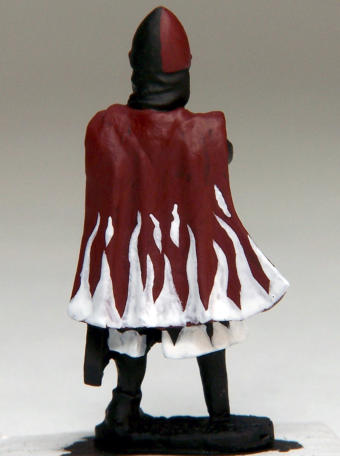
The cloak
was to be
red, so I
painted the
shade layer
for the
cloak, and
then the
design on
top of that.
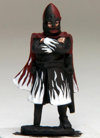
The whole
design is
painted in AP-
WP1102 - Matt
White.

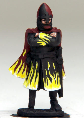
I then painted over
most of the white
with AP-WP1107 -
Daemonic Yellow.


